Using Dashboard
Let's say you want your service center, such as the service desk, to see how customer conversations are handled. The aim is to see quickly how many conversations are queuing and if there are enough serving agents.
Dashboard is the application where you define which queues to monitor, which information to show, and how this is presented. To show how the Dashboard UI works, let's look at two examples: one for Support and another for Sales, to get an overview of customer service in each business unit.
Adding statistics to the Home view in Dashboard requires the following:
- Rights to either view or serve in queues/queue groups or statistics summary or statistics details for queues/queue groups
- Statistics summary for users
Example 1: Are there calls in the queue?
- In the Home view, add a new tab or use the initial tab
My Statistics.
If you feel that the tab name is not descriptive enough for your purpose, rename it by clicking Edit Tab, change the name and click OK.
To create a new tab, click Add New Tab, enter a name for it, and click OK.
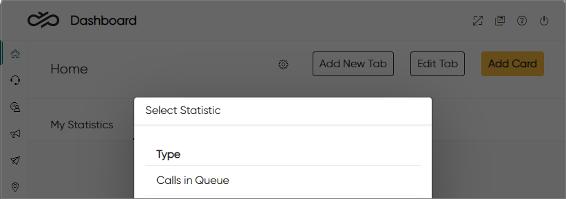
- Click Add Card and select Calls in Queue.
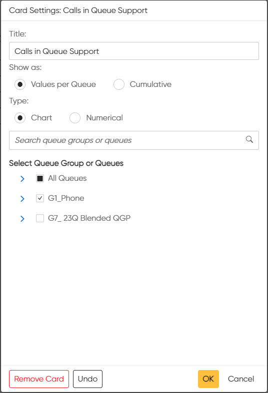
- Define the card content and its format:
-
Name the card.
-
Select one of the following:
-
Values per Queue: The card shows a value for each queue that has been selected.
-
Cumulative: The card shows one cumulative value for the selected queues.
-
-
Select the type:
-
Chart: The card shows statistics drawn as a graph or a pie chart.
-
Numerical: The card shows statistics as key figures in a large font.
-
-
-
Select the queues and click OK.
Below is the calls in queue presented as a chart and in numerical format:
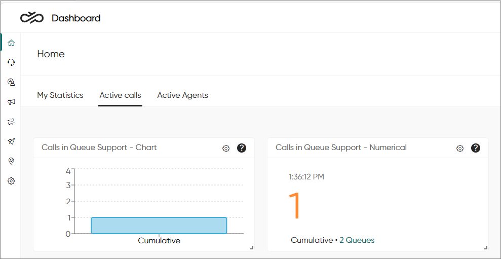
If later needed, you can go back and change your selections by clicking the settings
icon![]() .
.
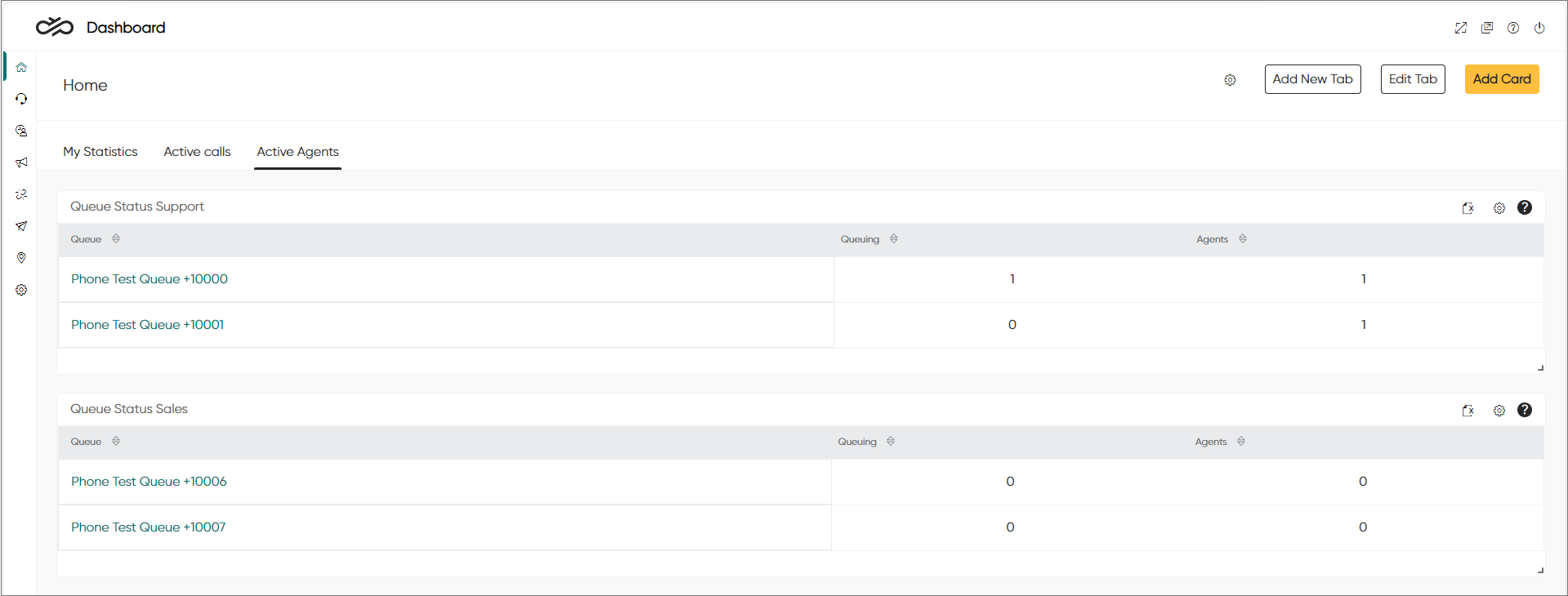
Example 2: Are there agents serving in the queue?
- In the Home view, click Add Card and select Queue Status.
- Name the card and select the queues.
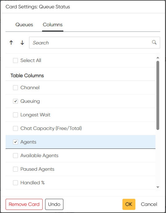
- In the Columns tab, select the columns to be shown in the
card. For this example, we select only Queuing and
Agents.
-
Click OK.
The Home view now shows queuing calls and serving agents in the selected queues.
To see when warning and critical levels for queues have been reached, define them in .
Wallboard view and carousel mode
You can also view the statistics in full-screen mode.
-
Click the wallboard view icon.

Now you can drag the view to a different display and show only the selected statistics as the browser's address bar and other settings are hidden.
You can also resize and move the cards in the wallboard view.
-
To leave the view, click the wallboard view icon
 again or
press the Esc key.
If you have added several tabs (10 tabs is the maximum), you can enable the carousel mode. Using carousel mode in wallboard view will allow showing more cards and tables.
-
Open the tab settings by clicking on the settings icon next to the tab buttons.

-
In the Tab Settings popup window:
- Switch on Enable Carousel Mode.
- Select the tabs you want to include in the carousel.
- Define how long you want each tab to be shown by entering the number of seconds in the Display Duration (sec.) field.
- Click OK.
- To stop carousel mode, click on any of the buttons that opens a popup window.
